A website that helps investment advisors and investors to view detailed information on any Sun Life Global Investments fund.
UGO Wallet
Mobile app & branding redesign
UGO
01 - OVERVIEW
TD Bank’s UGO Wallet is a free mobile payment app where you can store gift, loyalty, membership and other cards within a single app on your smartphone.
Introduced in 2015, it’s helped thousands of Canadians simplify their lives by helping to de-cluttering their wallets/purses and helped them save money or collect points that they would normally done with plastic cards or not at all if they didn’t have or couldn’t find their cards.
INVOLVEMENT
Research, Design strategy, UI/UX design, Visual design, Prototypes, Brand identity and Collateral material development.
TARGET AUDIENCE
Existing UGO wallet users as well as potential new users looking to de-clutter their wallets/purses.
PURPOSE
To unify the iOS and Android look and feel and improve the user experience of the UGO Wallet app. Also to expand the purchasing of digital gift cards for self-use or ability to send as a gift.
PROJECT DURATION
January 2019 - January 2020. (UGO 2.0 Launch) Various refinements were released post launch and are ongoing.
FEATURES
Digitize and store plastic gift, loyalty, membership or other plastic cards held in wallets/purses. Purchase and share gift cards.
TOOLS USED
Pen and Paper, Sketch app, Adobe After Effects + Lottie animation, Principle For Mac prototype app
02 - BACKGROUND
The initial Android and iOS UGO native apps launched in 2014 designed to be a near field payment system. The iOS and Android apps were designed by two different external venders. As a result, a major issue was the inconsistent user experiences across the two platforms. The Android app had a particular issue with the home screen where the card art was visually bisected where some cards were not able to be easily and quickly identified. Additionally users were unaware the cards could be reordered so that frequently used cards could be placed higher on the home screen and the ability to delete cards was difficult understand. Certain aspect of the UI also had issues where dark purple icons such as the left hamburger menu and the and and save icons had very low colour contrast. That issue was address in a subsequent release to adhere to AODA compliance.
03 - SCOPE
The scope of the project was a complete overhaul of both the iOS and Android apps as well as refined visual identity. That allowed for a common look and feel as well as address a lot of the usability issues in existing apps.
04 - SOLUTION IDEATIONS
The main user experience issues addressed were the sort, delete and view of cards. Sort and delete were placed in an area that was easily viewable and accessed by the user in the top right corner of the home screen. The drawer held the actions - Add, Arrange, Delete and 3 view options: list view, split view and full view. Full view was the default view when the first card was added. Then the view would automatically change to split view and list view as cards were added by the user.
05 - BUILD LAYOUTS
Below are just some over the over 400 screens designed for the various user flows between the Android and iOS platforms that were designed and built over a 1 year span. It was important to have a consistent look and feel across the two platforms as well as adhere to native Android and iOS platform standards. There were 9 distinct user flows to focus on different functionality and features.
UGO 2.0 Registration
Coachmarks
Add Card Flow
All Card, Use Card, Search
Send eGift Card
Profile Login & Security, RateApp
Device Migration
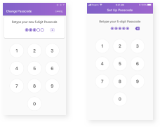
App Lock via Login & Set Password
Promo Cards
click to view more
06 - BRAND REFINEMENT
In addition to a complete overhaul of the app, the brand identity was also refined to reflect the UGO 2.0 feel.The initial logo was refined to be more flexible in it’s use across the app as well as other marketing material.
(original logo)
A number of divergent concepts were explored:
Final evolutionary design and variations:
The design was meant to be a familiar evolution of the original UGO Wallet logo.
The intention was to convey a sense of lightness by the 45 degree angle in certain uses.
The refined simplicity of the new logo meant it was easier to work with and addressed the various placements, backgrounds and sizes the logo would be used in.
07 - SUPPORT MATERIAL
A number of support items were were based on the UGO 2.0 visual language. Namely app store images, emails, support website and collateral marketing material that were displayed at schools, stores and promotional events.
08 - AWARDS AND RECOGNITION
4.1 star rating on the Apple App Store 4.1 star rating on the Google Play Store 100,000+ Installs 2020 Canadian Marketing Awards – Bronze winner (Retail Engagement)